Search Results for: chart Toggle Comment Threads | Keyboard Shortcuts

  • Belen 12:41 am on March 4, 2020 Permalink  

    Generating charts using Image-Charts and QuickChart 

    As we have shown in previous posts, you can use the keyword *chart to dynamically generate charts inside your GuidedTrack program. There are currently three types of charts you can create: bar, scatter and line. On those occasions when *chart doesn’t meet your needs, you may find Image-Charts or QuickCharts useful.

    Image-Charts is quite easy to use! All you need to do is generate a URL with parameters that contain the information about the chart that you want. You can then use this URL as an image to display:

    *image: https://image-charts.com/chart?chs=700x190&chd=t:60,40&cht=p3&chl=Hello%7CWorld

    Some basic parameters in Image-Charts are:

    • cht: Used to indicate the type of chart to display. The types currently offered are bar, line, pie, polar, radar and bubble charts as well as QR codes
    • chd: Data points to plot
    • chs: Size (in pixels) of the generated image
    • chl: Labels

    The documentation of the tool is very easy to follow and there are plenty of examples. They also provide a form that you can use to generate the URL.

    We have created a sample program so that you can see how it works. It uses data gathered from a brief questionnaire and displays three cool graphs:

    You can look at the code of the program here.

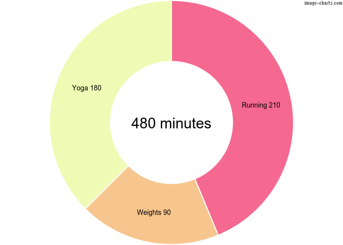
    Let’s examine the code that generates the doughnut chart:

    Here we have first created variables that are set to the values of the parameters that will be sent in the URL, which makes our code easier to read and debug:

    • Chart type: “pd” (pie doughnut)
    • Data points: The minutes the user spent running, doing weights and doing yoga last week
    • Image size: Entered in pixels
    • Legend and labels: These parameters are used in different ways depending on the chart type, so refer to the documentation or the URL generator if you need help defining your own

    We then build the URL and it is ready to display!

    When generating charts with QuickCharts, we also use a URL but in this case it looks like this:

    *image: https://quickchart.io/chart?bkg=white&w=500&h=300&c={type:'bar',data:{labels:[2012,2013,2014,2015,2016],datasets:[{label:'Countries%20Visited',data:[4,7,2,5,8]}]}}

    The base url is https://quickchart.io/chart and in the example shown we are setting 4 parameters:

    • bkg: background color
    • w: width
    • h: height
    • c: a chart.js object with all the data needed to plot the chart

    QuickCharts has a lot more types of graphs and options than Image-Charts so building the chart.js object may get complicated. There is a sandbox on their website with a sample object that you can modify to generate your own. When you are done, you will need to URL-encode it to pass it as parameter “c”. Refer to the documentation to see all the types of graphs available and the different options.

    Below is the code we have created to depict the exponential growth of a colony of rabbits using a logarithmic scale:

    *image: https://quickchart.io/chart?bkg=white&c={type:'line',data:{labels:[2012,2013,2014,2015,2016],datasets:[{label:'Rabbits',data:[98,212,510,739,1434]}]},options:{scales:{yAxes:[{id:'first-y-axis',type:'logarithmic'}]}}}

    And this is the resulting image:

     
  • Aislinn 5:05 pm on April 12, 2016 Permalink  

    Feature Update – new chart options! *color, *type: line, *ticks, multiple axes, and more 

    Here’s what’s new:

    Pretty chart colors

    We’ll start with the easy stuff. Splash up your graphical displays with some color.

    To start, you can find your favorite color from this website: http://colours.neilorangepeel.com

    Copy down the rgb code. For example, if you’re a fan of peachpuff, the code you want looks like this: rgb(255,218,185)

    When you’ve got your fav, you simply add it to your chart’s *data using the *color keyword, like so:

    In this example, we’re only using one color, not six. We’ll get to adding multiple colors in a bit.

    If you want boring colors like solid “blue” or everyday “red”, then you don’t need the rgb. You can just type *color: blue. This will work for many of the basic colors, and a few of the more creatively named.

    If you like the color you have, but it’s a little too intense, you can add *opacity to make it somewhat see-through, like this:

    Opacity should be a number ranging from 0 (totally see through) to 1 (totally solid). Here’s how peachpuff looks with different levels of opacity:

    If you have a custom color you want to use, go for it. The *color keyword will work with any rgb, not just the ones listed on the website above.

    Line graphs

    Let’s say I want to chart how my millions of dollars have grown over time (cause I’m saving for a yacht big enough to hold my helicopter).

    I can use a line chart like this:

    The code for this is pretty simple. You add data similarly as you would in a scatter plot, indicating the x and y points. You also do *type: line

    Here’s the example:

    Add *ticks – i.e., customize the look and position of the intervals on the axes

    Charts with money are fun, but they’re hard to read without $ signs. Maybe I also only want to show intervals of $10,000,000, instead of $5,000,000. And maybe I want to call that $10 mil. instead of using all those annoying 0’s.

    Let’s try this:

    Much better!

    Here’s how to do that:

    It’s the same line graph as the one in the earlier example, but this time I’ve added something called “*ticks” indented beneath the *yaxis keyword. The *ticks keyword let’s me specify [the numerical value of where I want the tick to go, “the label I want to give that tick”]

    In the case of *ticks, the value comes first and the label comes second. With bar graphs, the reverse is true (bar label, then value). We didn’t do this to try to confuse you, but here’s a tip: in each case try to put the most important info first. Whereas both the bar label and value are required, the label on *ticks is optional information. You could also just have something like *ticks: [2, 4, 6, 8, 10], which would display just the even numbers and label them for you automatically.

    By the way, I decided not to buy a yacht for my helicopter after all. Instead, I decided to learn the principals of Effective Altruism and give my money to highly efficient charities and save lives. Go me!

    My new goal is to chart my quarterly distributions to charity. Instead of having an x-axis with years, I instead want them to say “Quarter 1”, etc… like this:

    The code is very similar as the earlier code, except now I’ve also included *ticks for the *xaxis:

    You’ll also notice that for the first *yaxis tick I used “” as the label, which means the label is just blank. This can sometimes be helpful for making your chart look a little smoother.

    Don’t forget you can also use *min and *max beneath your *xaxis and *yaxis to help smooth things out. For example, the x-axis is looking a little crowded. If we set our *min at .9 and our *max at 4.1, they’ll be a little more room.


    Here’s the code with the new *min and *max added:

    Multiple *data keywords for multiple customizations

    Now let’s return to colors. Remember my chart at the beginning? With all the super awesome colors? The key to this snazziness is using multiple *data keywords. Each *data keyword gets its very own *color keyword.

    If you just indent *color: yourcolorhere beneath the *chart keyword, that color is going to apply to the entire chart. If you want to be more specific, then you’ve got to be more specific with your indents. Check out the below code and see what I mean:


    Instead of lumping all my data points into one *data keyword, I split them up, so that I could then apply a unique *color attribute to each *data point.

    The outcome to the above code will look like this:


    If you want mostly light blue bars, with just one vibrant orange, then you do this:

    The lightblue becomes the default color for all the bars, because it’s indented beneath the *chart keyword, but the color for the fourth bar is overridden with an orange color.

    Multiple types of charts on one chart – and multiple axes on one chart

    Let’s say you want a line graph AND a bar graph on one chart, cause you’re a chart maniac.

    For example, you’re a farmer charting how many pounds of kale you sold and how much money you brought in. You want your final chart to look like this:

    To start, you have two different types of charts. You’ll need to add multiple data keywords, one for each type of chart.

    In our code above, we’ve used the numeric values of the summer months (6 for June, 7 for July, 8 for August). We’ve also indented the *type keyword beneath each data keyword to specify how to display the data. We’re showing the pounds sold as our bar graph data and the income made as the line graph data.

    This code results in a pretty ugly chart though:

    More work is needed! The number of pounds sold ranges from 32-44, while dollars earned ranges from $320-$396. Each data type will need its own *yaxis for good chart chemistry.

    We can have multiple y-axes and/or multiple x-axes. We just have to be sure to give each a name, and then link their name beneath the data they serve. We also have to tell the program where to *position each axis: on the left, right, top, or bottom, like so:


    In this code, we’ve now indented *yaxis: pounds beneath the bar graph data, because that’s the data it’s attributed to. “pounds” is just the name we made up, you can call your axes anything. We’ve also indented *yaxis: dollars beneath our line graph data.

    Next, if you have multiple axes, you should specify their *position. In this case, we want the pounds’ *yaxis to be on the left side of the chart and the dollars’ *yaxis to be on the right side of the chart.

    You always indent the specifications of an axis beneath a *yaxis or *xaxis that is indented beneath the *chart keyword, not beneath a *data keyword. Axes are attributes of the entire chart, and multiple *data keywords can share the same *yaxis or *xaxis information. That’s why, when you want to provide details about the axes (such as their *ticks, *position, *min, or *max), you include this info beneath the *chart keyword more broadly. In other words, this is bad:


    Okay, now our chart looks like this:

    Getting better! But still not great… Let’s change the *ticks on the y-axes so they’re more clear…


    This is the same code as before, except now we’ve specified how we want the labels to read.

    The easiest way to add *ticks to a chart with multiple axes is to first look at where the ticks naturally fall (in our earlier chart you can see there are lines on the 10, 20, 30, 40, and 50 marks on the left axis).

    Once we know where the lines naturally fall, we can work with these existing lines to give them better labels. “10” becomes “10 lbs”, “20” becomes “20 lbs”, and so on. If you don’t like where the lines naturally fall, you can try first adding *min and *max values to the dominant axis.

    The lines will only appear for one axis, not both. For the second axis, you just have to add labels wherever you’d like them to appear. In this case, we wanted the labels to increase by $25, starting with $300. We added code for the *ticks at the 300 mark, which would read “$300”, another at the 325 mark, to read “$325”, and so on.

    Now our chart looks like this:

    That’s pretty good! New *ticks for our *xaxis and some colors would improve things though. Plus, it’s hard to see the lines through the bars, so we should add some *opacity.

    If we set the *min for the *yaxis: dollars to 275, that would also align the dollar values with the lines corresponding to the pounds, which would look swell!…

    This final code generates the image we started this section with. For a reminder, it looked like this:

    With our code, we didn’t need to specify a name for the *xaxis, because there’s only one. If we wanted to though, we could add more. One at the top too. We could even add multiple x-axes at the bottom! We could have 6 y-axes and 7 x-axes just because we were feeling crazy!

     
  • Aislinn 1:01 pm on September 14, 2015 Permalink  

    Feature Update – *share your program, set *min and *max values on a *chart 

    Here’s what’s new:

    Entice users to *share your program

    Users will be able to easily share your program via Facebook, and pretty soon we’ll be adding a Twitter option as well.

    Here’s how the button will look to users:

    Here’s what they’ll see when they click the button:

    And here’s the sample code:

    These posts will automatically link to your program and can be customized with three pieces of information:

    • *description: (required) the text description of the program to be shared.
    • *title: (optional) the larger title that will display across the user’s post.
    • *picture: (optional) the image that will appear in the post.

    A couple tips to keep in mind:

    • You can use variables in any part of your share data.
    • The ideal image size is 1200 x 630 pixels, or, a 1.9:1 apect ratio.
    • Facebook doesn’t know quite what to make of certain symbols, such as a %. These may need to be written out (e.g. writing “percent” instead of using a % sign), as we’ve done in our example.

    Add *min and *max values to your chart


    By default, the x- and y-axis of a chart will stretch to a size relative to the largest and smallest bits of data you’re displaying.

    You can customize the size of your chart though with ease. For instance:

    Setting a *min of 0 won’t be necessary if your chart data is always in the positive, but it can be useful when you have very specific ranges you would like to set.

    You can additionally customize the *xaxis with *scatter charts.


    Update: use .shuffle instead of .randomize

    Let’s say you have a collection like so:

    If you wanted to randomize the order of a collection, you would previously type >> .randomize

    However, a new update requires you to shuffle your collection like so:

    Why this change? There was some confusion over the difference between *randomize and .randomize. *randomize still functions as it always did, allowing you to randomly provide one of several possible bits of text or code to the user. With .shuffle though, you don’t just randomize one item in a collection, but shuffle all of them around. You’ll see shuffle used again in another soon-to-launch feature that shuffles question answer options. 


c
compose new post
j
next post/next comment
k
previous post/previous comment
r
reply
e
edit
o
show/hide comments
t
go to top
l
go to login
h
show/hide help
shift + esc
cancel